Eric Hill (OBE) was an English author and illustrator of children’s books, best known for his Spot the Dog series. He first worked as an errand boy in an illustration studio, where he was encouraged by his peers to draw cartoons and comic strips in his spare time.
After completing his National Service, Hill worked as a freelance illustrator and designer in advertising, before he started writing short stories for his son in 1976. In 1980, his first book, Where’s Spot? was published, the initial story in a series which sold over 60,000,000 copies worldwide, was translated in 60 languages, and adapted into a children’s television show.


The use of minimal outlines, block colours and basic shapes means Hill’s illustrations are easy to recognise, giving Spot an identity, which in any aspect of design is important in my opinion. The pure simplicity of the books (and accompanying illustrations) is what makes them so popular, from a very young age. Personally speaking, the Spot the Dog series is one of the first memories I have of reading, and these books are still sold to this day, proving the books and their illustrations have a lasting effect on children.


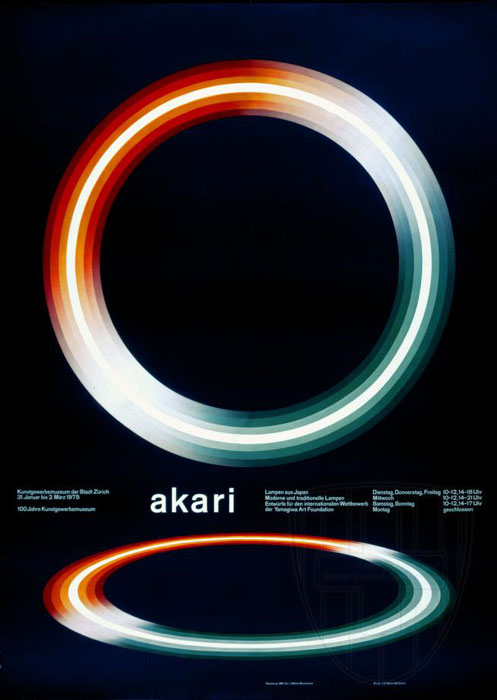 The design above is an advertising poster for an exhibition in Germany in 1975, for a Japanese lighting company called ‘Akari’. What strikes me most about this piece is how simple it is. The vibrant, glowing colours draw the eye into the centre of the design, and the dark background makes the design stand out even more. The piece itself is elegant, crisp and formal, with the symmetry and clean typography complimenting one another very well. Muller-Brockmann uses shape and typographic elements to great effect in the vast majority of his pieces, which makes him my go-to designer when considering layouts/spreads.