CoLAB Project Evaluation

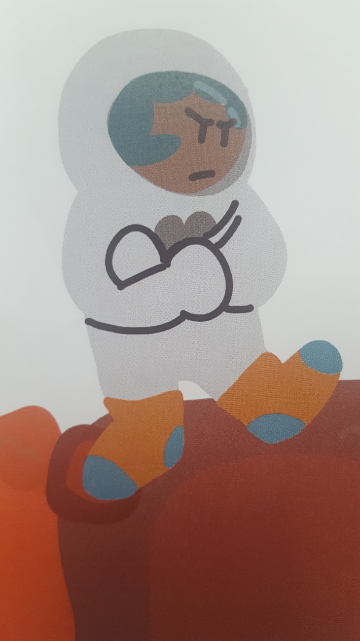
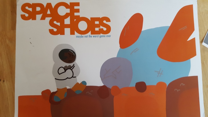
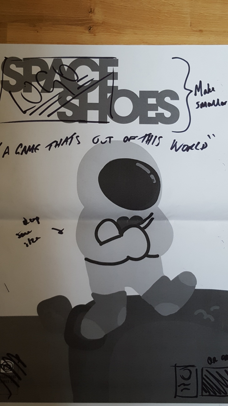
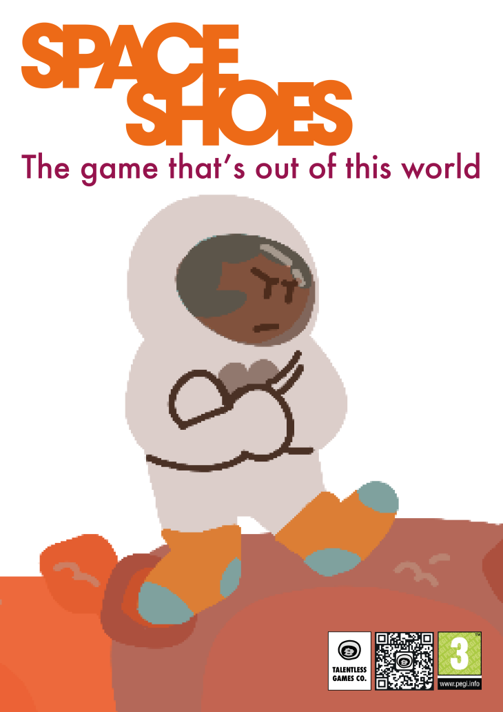
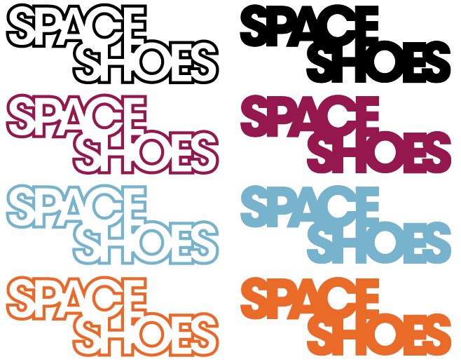
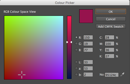
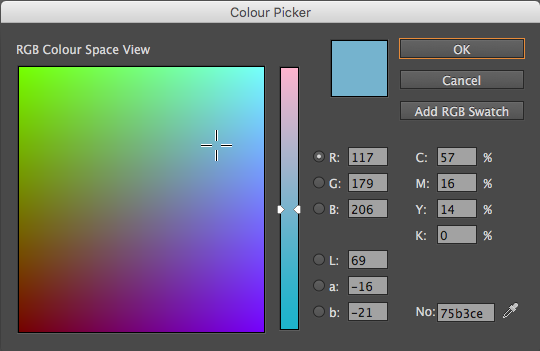
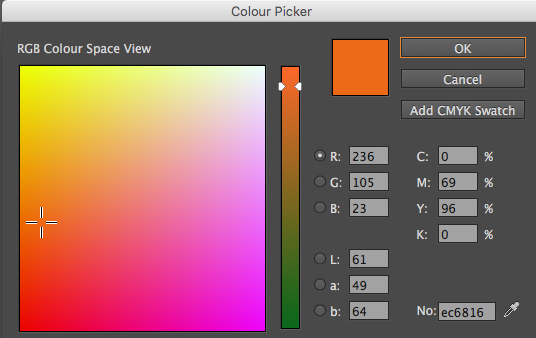
In this project, we were tasked with creating a game as a collaborative effort in a group. We were assigned one of three roles – Illustrator, Game Artist, or Graphic Designer. I was given the job of Graphic Designer, and as such was responsible for the branding, marketing and styling of the game. The opportunity to work as a graphic designer was the most inspiring part of this project for me, having had to use different areas of my creative practice that I was less comfortable working with. To translate this into my work, I paid homage to my love of typography and how it can be used to create an identity so very easily. I am fairly happy to say that I achieved pretty much everything I had set out to produce for this project, in terms of our group work and my own personal work. Between the three of us, we created a functioning game, complete with promotional material. Special credit must go to Artemis, who held the team together and offered her insight on numerous occasions, stepping in to help in any way she could. I do want to point out that I feel like Tom (our illustrator) could have contributed more towards the project, however I don’t want to rant on about others in my evaluation. I am somewhat disappointed I couldn’t produce the badges and shirts I had planned to sell at the CoLAB Show, however these were non-essential components of the project and as such don’t affect the overall outcome. I feel the project ran very smoothly, I had a few minor hiccups with selecting typefaces and colours but these issues were easily resolved. I am particularly pleased with the logo, which was the one thing I wanted to get right above all others. Creating a strong, recognisable brand via a logo is key, and I feel like the Space Shoes logo could be just that.

Overall, this project has been an eye opener for me, as I am normally not overly keen on working as part of a group, however, I realise that if I am to become a creative practitioner, group work and communicative skills are essential. I would happily work as part of this team again, providing all three members put in an equal amount of effort. After completing this project, I am much more confident working as a graphic designer, knowing more of the responsibilities that would be expected of me certainly made this project more enjoyable.

Back Story

Below is the back story myself and my game artist conceived almost immediately after being teamed up together. We more or less had the backbone of the game in our minds after five minutes or so. This will be available to read when people visit our game stand at the CoLAB show

SPACE SHOES
THE GAME THAT’S OUT OF THIS WORLD

It is the year 2419, and humanity has long since abandoned Earth, living now on Planet G, at the edge of the Solar System.
Our anonymous astronaut is on daring mission from Pluto – her staging post as a Space Cadet – to the planet Mars, in search of a pair of extremely valuable shoes she left there whilst refuelling on her way back from a scouting mission on Earth’s old Moon…

All is going smoothly, until she reaches the area between Jupiter and Mars, The Asteroid Belt. Her ship malfunctions and crashes into a nearby asteroid, shattering part of the ship into pieces…

Now, she faces a desperate search through the Asteroid Belt, hoping to collect the pieces of her ship she needs, in order to find her long lost pair of shoes…

Marketing – Twitter/Facebook Pages

The final thing I did was create social media accounts for the game, as a way of reaching out to a wider audience to promote our material. Facebook and Twitter are being increasingly used by companies to promote their products, as there is a huge online presence in this day and age.
By using the Social media accounts, we have access to a bigger range of people, allowing us to get our message across easier.

@SpaceShoesGame on Twitter

Space Shoes – The Game on Facebook


Style Guide

Here, I have included the Style Guide that I made for this project. The style guide is basically the list of rules and components I had set myself to work with to produce material for this project. I included the three main components already spoken about here – typography, colour, and logos. A physical copy of the style guide has been submitted with my work, for the show. The link below will open my Style Guide

design-guide

Game Poster Design

The next important part of this project was producing a promotional poster to advertise our game. As with all other aspects of the design for this project, I wanted a clean, simple design that would clearly show what our game was about.

First of all, I had to get an illustration to form the basis of the poster. The illustrator in my team refused to produce this illustration, despite me asking him to produce it for a period of at least two weeks. Instead,I had to ask our game artist to provide me with an illustration I could use viably for the poster. Luckily, she was more than happy to help right away, and I was finally able to finish making the poster.

wp-1481464199516.jpg

The image above is a cropped version of the image provided by Artemis (our game artist) to be used as the main focus of the poster. It features our anonymous astronaut, the only playable character in the game to date.

wp-1481464182709.jpg

Next, I added a logo to the image to try and make it more poster-like. The orange logo worked better than any of the others, in the opinion of myself and my team members. The landscape version of the poster didn’t work very effectively, in my opinion, so I tried again with a portrait orientation.

wp-1481464178260.jpg

The image above shows the  final detailing for the poster designs. I decided that to give it a bit more realism, adding a company logo (Talentless Games Co., a mock company for our “game development”), a QR Code that when scans leads to a Twitter page I also created for the game, and a PEGI age rating which is present in almost every game available to purchase digitally or physically.

poster-final

Here is the final poster design, with all the elements combined. I think the composition and the colours both work incredibly well, and it clearly communicates that we are advertising a new game. Knowing the necessity of producing a high quality poster to showcase our game, I not only took opinions from my team, but also my fellow classmates, and even had a few tell me if I were to produce the posters for sale, they would actually buy them.

Shirt Designs

As a side note to the main project, I created some t-shirt designs which I had hoped to put into production in time for our CoLAB show on 13-12-16, but due to financial limitations, I couldn’t afford to fund the printing of the shirts. However, I thought it would be worth including some of these designs on my blog, as evidence of branding opportunities I explored during the course of the project.

Above are a few examples, I did use all three colours, plus also the logo in white, and the final logo, as I was going to try and get one of each made for sale at the show.
I particularly like the designs with the logo spread across the chest, with their retro look I think if they were actually produced they could sell rather well. I asked numerous people on my college course – and out of college – and had at least 20 people say if the shirts were at a reasonable enough price they’d consider buying one, which can only be a good thing, right?

Colour Choices

After numerous colour tests, conducted with the help of the game artist in my group, the colours we settled for to use in all aspects of the game were a medium-dark purple, a light blue, and an orange. We studied many pictures of space, focusing on the colourful images of nebulae, to see which colours work well with one another in the context of outer space.

screen-shot-2016-11-29-at-12-20-43

We chose a relatively deep purple for the main background colour, for almost every aspect of the game and its branding. We did so because it is a very “space-orientated” colour, and also because it acts a great counter for the other colours in our designs, which are much lighter.

screen-shot-2016-11-29-at-12-20-23

The light shade of blue we chose is meant to be a reference to the stars. In the numerous photographs we studied, the stars were either a white-yellow, or a very light blue. After many tests we decided blue would be best. It also works surprisingly well with our purple and orange colour choices.

screen-shot-2016-11-29-at-16-16-19

For the orange, we thought we’d include a direct reference to Mars, which plays a key part in the back story of our game. We chose a lighter shade, so it wouldn’t overpower the purple and blue. We had numerous different tones of orange to experiment with, but this was the best one by quite some way.

Typography Choices – Body Text

For the body text in the designs I produced for this project, I chose Futura as the typeface. Futura, a geometric sans-serif type, was designed in 1927 by German typeface designer Paul Renner.

Another clean, crisp typeface, I felt that Futura would work well with Avant Garde, much better than a serif-based type would. I did test with Avenir (a typeface designed by Eric Gill, one which is very similar to Futura) but I felt that Futura was more suitable. I wanted to keep a futuristic, simplified feel to all the text elements of the promotional and design work for this project, and both typefaces I’ve selected do that very effectively, in my personal opinion.

Typography Choices – Headers

For the headers and main detailing of the designs for this project, I chose to use ITC Avant Garde Gothic, the typeface designed by Herb Lubalin (see previous post).

Screen Shot 2016-12-08 at 15.22.39.png

Four different weights of the ITC Avant Garde Gothic Standard family

I chose this typeface because as a group, we wanted a clean, legible typeface that would reflect upon the futuristic yet simplistic nature of our game, a typeface that would be easy to read on screen and in physical form when printed. Avant Garde is a crisp, modern sans serif font developed during the 1970s by the International Typeface Corporation, and is still widely used to this day. It is a font that has stood the test of time, and during my initial experiments I decided it fit into the game perfectly – a clean typeface offset by the rough, unrefined nature of the game.