Month / February 2017
Magazine Advert Design – Final Design
Magazine Design – Development of Final Idea
Magazine Advert Design – Initial Concepts
Magazine Design – Sustainable Advertising
Logo Design – Final Logo
The Future – Project Brief
For this project, we have been given a live brief, for a corporate identity, packaging and advertising campaign promoting and rebranding a non-profit sustainable energy company in the local area.
The company I have chosen to rebrand is South Devon Coastal Renewable Energy Network, or SDCREN for short. I shall give more of an in depth background of the company in my next blog post.
For this project, I am tasked with creating the following:
- A new logo and branding style for SDCREN
- An A4 letterhead, a 1/3 A4 compliment slip, and a business card, for SDCREN
- An animated GIF or Sting (3D or 4D preferred) for SDCREN
- An A4 magazine advertisement calling for voluntary fundraising support for SDCREN
- A new website – including a home page and two other pages, for SDCREN
All outcomes are to be mounted on mount board for presentation. The deadline for this project is Monday March 13th.
Group Critique Feedback
Towards the latter stages of the project, after I had completed the designs for the final spread, we held a cross-college group critique with the other Pre-Degree courses at Palace Court. During this critique, I received a lot of positive feedback from the people in my group. They unanimously agreed that the concept and layout of my spread was a good, solid idea, that it all made sense, and that the balance of type and imagery was even, and worked well.
I did give them a copy of the design each to try for themselves, but as of yet I have not had any of them back. With that said, I was incredibly encouraged by the feedback I had received, knowing I did not really need to make many changes to my design.
Overall, I believe the group critique process is an important stage of each project, because it gives voice to another set of opinions, on top of those of the children from the school, my family, and my classmates on my course. I also feel like I made a positive contribution to the projects of the other people in my group, offering my constructive feedback on their projects.-
Final Idea
My final idea came from a combination of help from the children at PSCA, and my own re-worked designs. I stripped back the emotion-faces, making them more simple and easier to distinguish. I also reduced the amount of typography on the spread, because as mentioned in the previous post, the children found that there was too much cluttered, unnecessary writing that confused them. I also added a few extra elements, such as the ability for the children to completely personalise their own pages by colouring everything from the header to the emojis. Finally, on the right-hand page, I have left a large blank space for the children to ‘draw themselves, to represent how they are feeling at that moment in time’.


Above are the ’emotions’ that I have digitised as part of the final design, these will be the ones the children can digitise. I did a test on my Auntie’s three children – aged 9, 7 and 5 – and they could all tell me what at least 5 of the 6 emotions actually were.
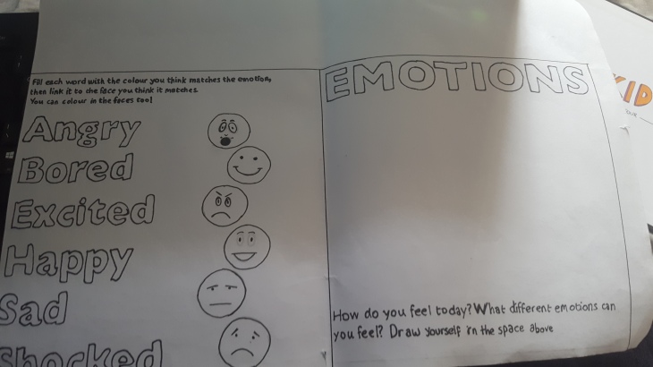
Above is basically the final design, showing the layout and components all pieced together. The basic idea is for the children to match each emotion with the correct image, then colour it in, in the colour they think corresponds to said emotion. They can also, if they wish, choose to fill the words with colour. The main purpose of the spread is to get children thinking about how different facial expressions represent different emotions, and also how colours can be linked back to emotions – for example most of the children I asked as PSCA told me that they most often associated the colour red with either anger or love.
PCA Meets PSCA
During the course of this project, we visited a nearby arts school, to give our designs a little bit of real-life testing, with the Year 2 students. I took the two designs from my previous post with me, however the children didn’t really take to either of them in a way I had hoped.
Design 1 – Feedback:
- Too many words
- Too many emotions in one place
- Ugly
- Difficult to read
- Too much on page
Design 2 – Feedback:
- Boring
- Not as good as the other one
- Not interesting enough
- Too much writing
- Not enough pictures/images
Taking this feedback on board, I decided to go back to the drawing board, and re-work the first design into something more fun and exciting that children would actually enjoy. The idea I came up with was to reduce the amount of typographic elements, and also the amount of illustration used. Judging by the reactions of the children at the school, they wanted a finer balance between text and imagery, whilst also feeling like there wasn’t really any level of interaction on their behalf with the spread.
During my time with two of the students, Eva and Caeden, I asked them to draw six different emotions for me, in the form of a “smiley” face… 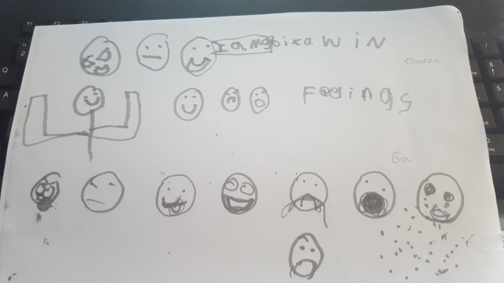
I decided to try and interpret these images in my own style to use in the final design, as I felt they represented a more accurate embodiment of emotions in the eyes of children.
