During the course of this project, we visited a nearby arts school, to give our designs a little bit of real-life testing, with the Year 2 students. I took the two designs from my previous post with me, however the children didn’t really take to either of them in a way I had hoped.
Design 1 – Feedback:
- Too many words
- Too many emotions in one place
- Ugly
- Difficult to read
- Too much on page
Design 2 – Feedback:
- Boring
- Not as good as the other one
- Not interesting enough
- Too much writing
- Not enough pictures/images
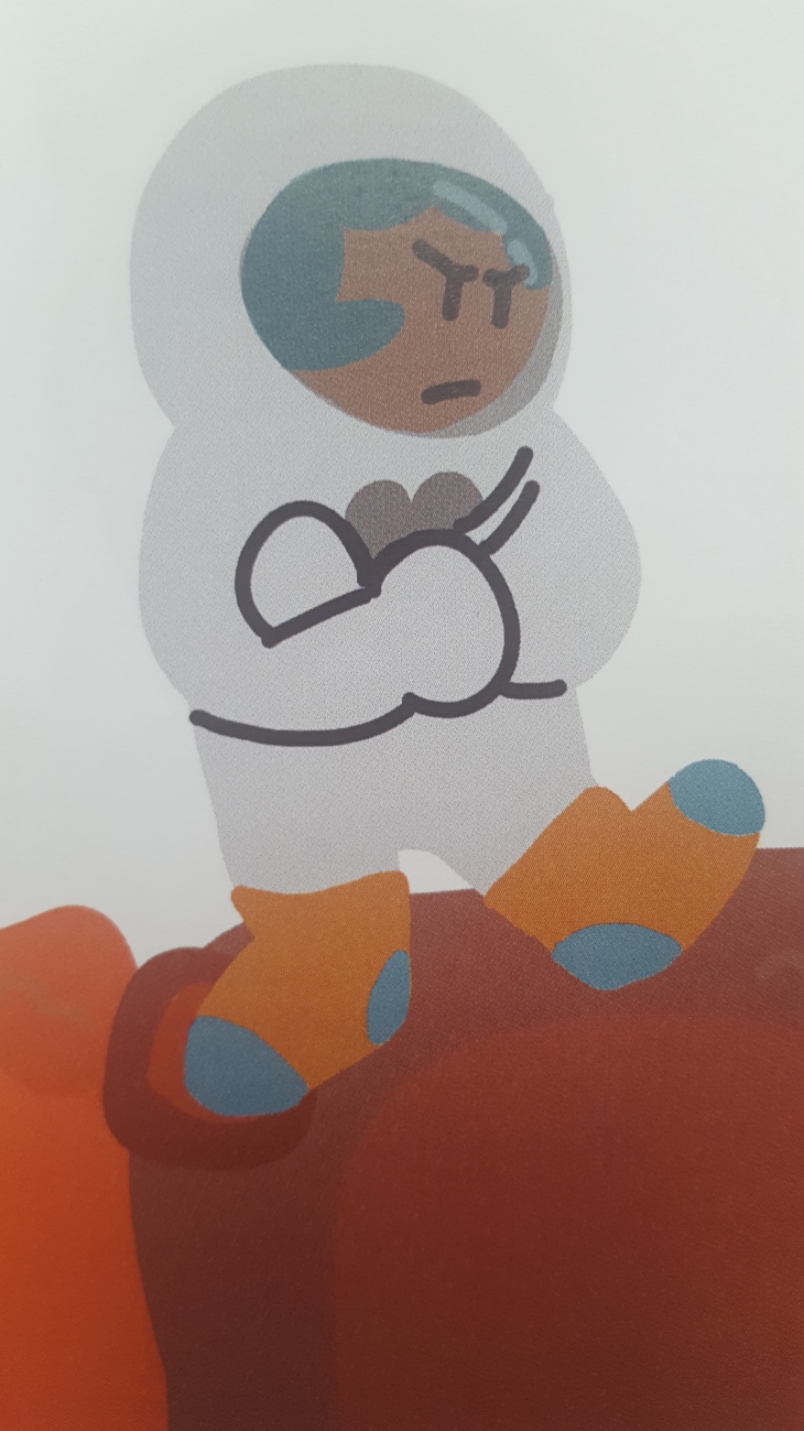
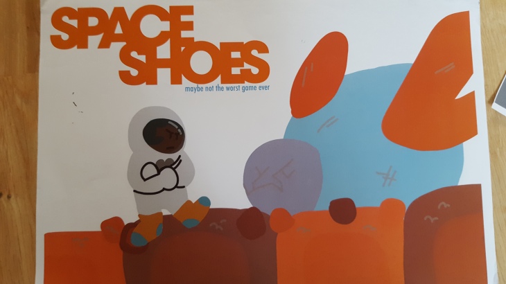
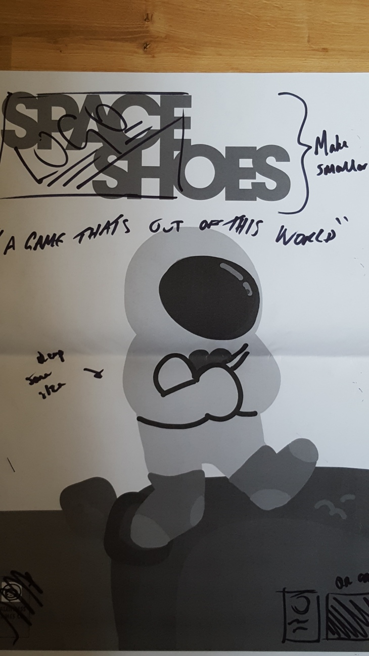
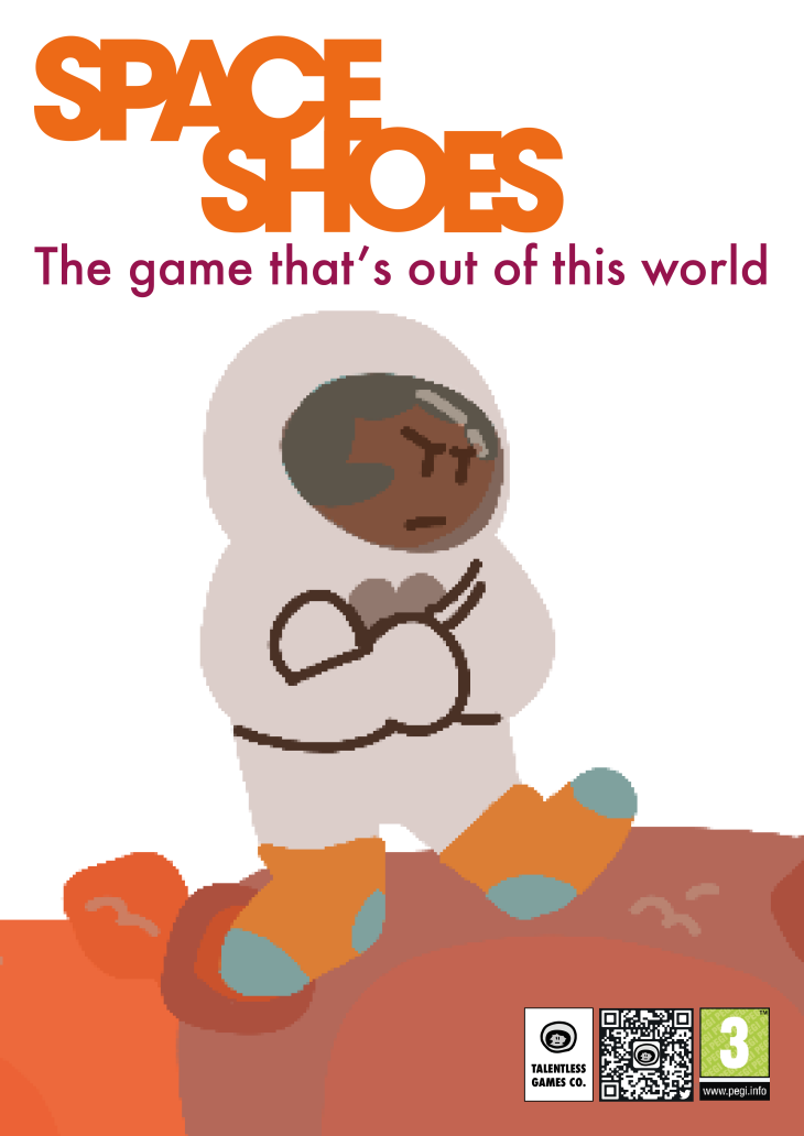
Taking this feedback on board, I decided to go back to the drawing board, and re-work the first design into something more fun and exciting that children would actually enjoy. The idea I came up with was to reduce the amount of typographic elements, and also the amount of illustration used. Judging by the reactions of the children at the school, they wanted a finer balance between text and imagery, whilst also feeling like there wasn’t really any level of interaction on their behalf with the spread.
During my time with two of the students, Eva and Caeden, I asked them to draw six different emotions for me, in the form of a “smiley” face… 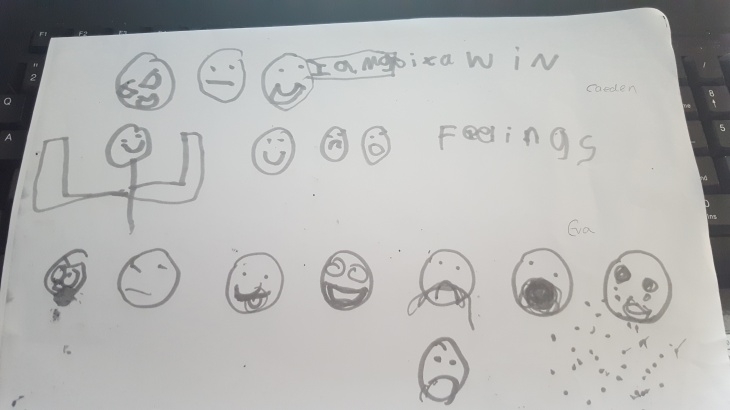
I decided to try and interpret these images in my own style to use in the final design, as I felt they represented a more accurate embodiment of emotions in the eyes of children.